What tips and scene-composition / layout-composition techniques could you contribute to someone who is just beginning to learn about the concepts?
1. Observe nature (and pictures of nature). All of your questions about color, texture, juxtaposition, road numbers, locomotive details, weathering patterns and other modeling content can pretty much be answered with a short trip to the local rail line, or a quick google image search of your topic.

2. Don't hide behind "There's a Prototype for Everything" Yes, there probably is. However, it is in modeling the mundane, day to day reality that makes our modeling look more realistic.
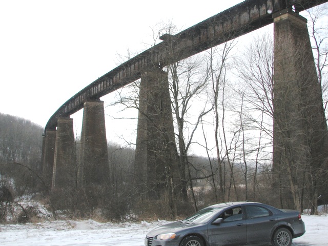
While this bridge is certainly spectacular, this next one might look a little more appropriate on your 4x8...
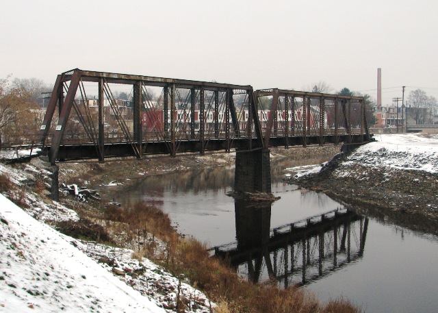
3. Try to visualize your scenery WHILE you're designing your track plan. Too often we get the tracks to do what we want them to do, but we leave too little room to create a realistic scene. This leads to multiple passes through the same scene, turns that are too tight, industries that look too small to warrant rail service, and a whole other myriad of sins. I'm certainly guilty of this one myself.
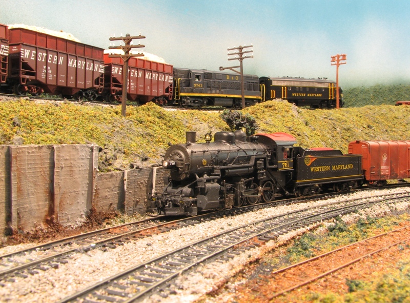
While I'm generally able to disguise these things in my photography, actually operating in these situations can be a challenge...
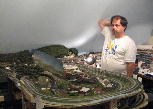
FYI, the peninsula in the foreground is currently undergoing a significant reconstruction to solve the problems created by the original track plan.
4. Don't be afraid of a little "Theater". In the end, you're building a model railroad. As such, the logical stars of the show are your trains. The supporting cast would be the scenery elements that are served by those trains. This is where your focus should be. I frequently read questions such as "What is the appropriate radius of a highway exit ramp?" or "How many parking spaces per square foot of retail space in Tuscaloosa, Alabama?" or some other such minutae that is totally irrelevant to the model railroad. To dwell on these ancillary details will leave you with a layout that might be technically perfect, but in the end is stark and odd looking. The more important questions would be, "How much of that exit ramp will be seen from the viewing angle that highlights the railroad?" and therefore, how much of that exit ramp do you really need to model? Or, "I've got a 6" x 12" area where I'd like to include a parking lot, how can I lay it out so it looks like a busy parking lot from the railroad? Or, what view blocks and details can I include to suggest a larger lot than I actually have room for?"
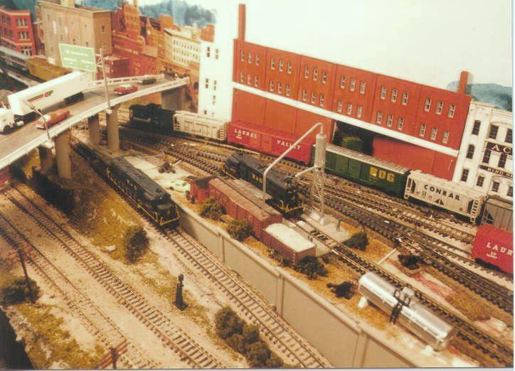
This scene was about 12" deep, but using the 3-D flats and 2D images on the back drop, some changes in elevation, and the highway bridge, which tapers from wide to narrow as it approaches the wall, create the illusion of a much larger scene. All of those background elements merely provide a stage for the trains to run through, so whether or not everything is perfectly in scale is immaterial.
Viewing angle is the key to what is and isn't important. It's okay to pinch a roadway down to nothing behind a clump of trees if you're never going to see that from a typical viewing angle.

5. Sweat the Details that Matter. This is the corollary to No. 4. While there are some things that just fade to the back ground (and should), there are others that demand, and when done properly, command your attention. Elements that contribute to the realism of the railroad itself. The track infrastructure is one element that I believe makes or breaks a layout's appearance. Unballasted snap track ain't going to cut it in my world. Nor will any of the pre-fab track systems with the big plastic roadbed already attached. I know there's a lot of folks that swear by the stuff, but as I stated previously, I'm very visually oriented, and there's just too many compromises for me to use that stuff.
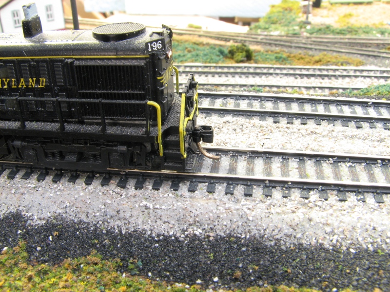
Same with bridges. It doesn't take much effort to look closely at a prototype to figure out what proper support looks like, or to determine what type of bridge is appropriate for a particular location. I covered this in a previous post.
Railroad-oriented structures should also carry their own weight. Again, this doesn't mean you need to model brick for brick or inch for inch to scale. But you should strive for a level of detail that exceeds the general level of the layout. After all, this is where the drama of your railroad is played out.
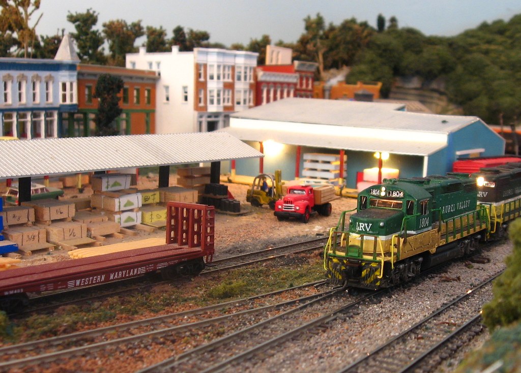

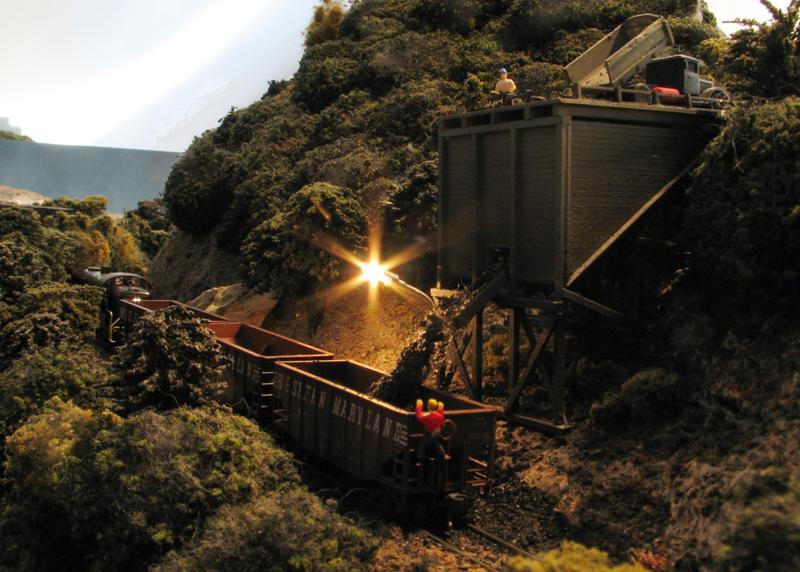
It doesn't require an "over the top" approach, either. Of course, an urban setting will require more attention than the more rural scenes above, bet even there, it's important leave some room for "nothing" between the focal points.
Finally,
6. Find a Theme and Follow it with Gusto! Building a layout is not a project that provides instant gratification. In fact, it can take years and years of work, usually being woven in and out of the other activities of life. Our interest can vary from fleeting moments dedicated to quick projects like weathering a few freight cars, to intense periods of major construction of benchwork, or installation of a new wiring system or signals. Given this long term commitment, we often find our interests drifting in and out of focus.
There are a lot of guys out there for whom this isn't an issue. Their main interest is in modeling passenger trains, so they are perfectly content to have the Broadway Limited pulled by a GG-1 running around the same track plan as the Empire Builder. That's fine, and serves the modeler's purpose. But unless the layout is based around a major terminal hub, it's hard for the casual viewer to fully appreciate the collection. Rod Stewart's urban terminal layout comes to mind. In the article, Rod confesses to being a passenger train fan, and makes no apologies for the eclectic collection he runs. But the setting in the big, busy city quickly conveys to a visitor the joy he finds in running the trains.
For others, a theme might be established following a particular prototypical line, or maybe a fictional route of an actual railroad. Others may dream up a free-lanced railroad that combines favorite elements of a few railroads, or just expresses an interest in a particular type of traffic in a particular region, like an Appalachian coal road, or a Midwestern grainger.
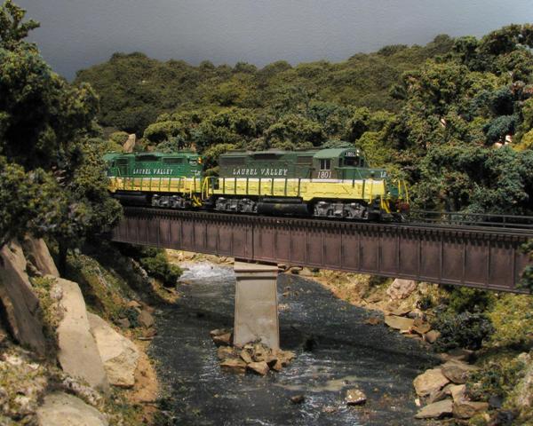
So there aren't any hard and fast rules about HOW to follow a theme, or even what theme to follow. But as a general principal, it's a good idea to have something in mind to guide your track planning, scenery choices, and rolling stock purchases.
You'll also find that as you drill deeper into your chosen theme, there's all kinds of subtle details you can add that enhance the realism of your layout. On my Western Maryland themed layout, I started with an idea of what parts of the operation I wanted to emulate, what types of rolling stock I would need, and the kinds of engines I would want to run.
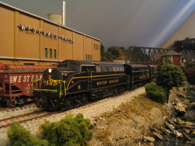
From there, I started learning more about the railroad's architecture, traffic patterns, interchanges, and other details I never imagined. I was able to take this newly gained knowledge and come up with projects that would help really cement the time and place of my layout.
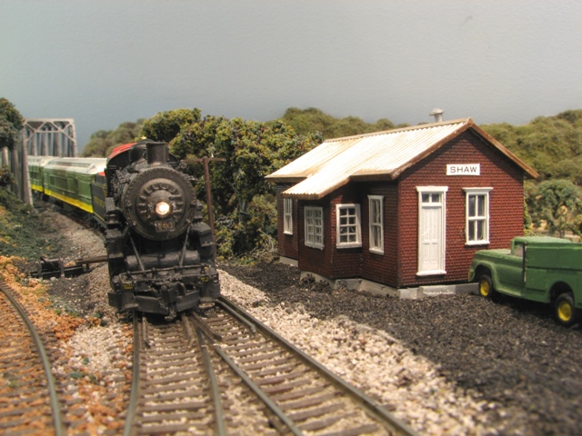
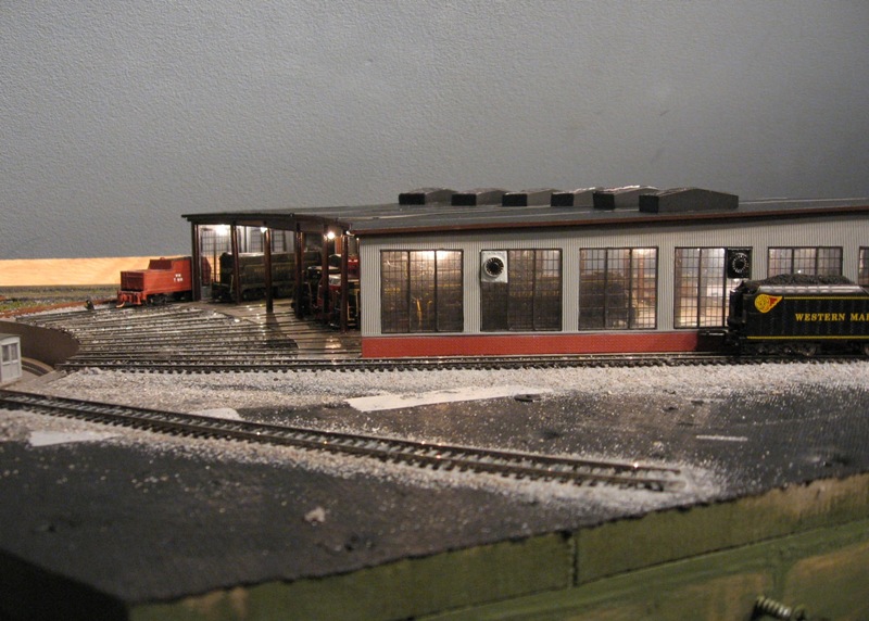
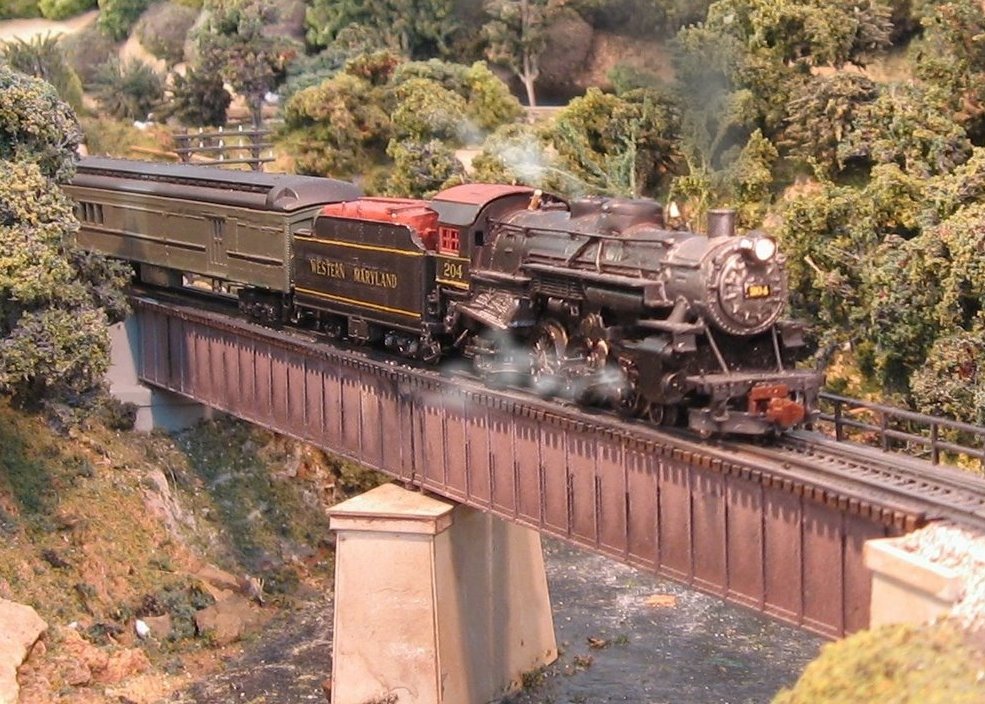
To sum up, don't be afraid to push the boundaries of your comfort zone. If what you built was really good, look at it again, and see what it would take to make it really great! There's a tremendous amount of pleasure to be gained from learning a new skill, or trying something different. If you're content where you are, well, that's fine. But if you see other layouts that really strike a chord with you, get busy! Start small, work on a small corner of your layout and finish it. Move on to the next section, and see if you can do better than you did on the first section.
You can create a scene that has a powerful visual impact, defines your locale and era, and impresses the operator, casual visitor, and photographer...

Now get to work!
Lee
No comments:
Post a Comment